Vivek Joshi
December 2025 - Old Age
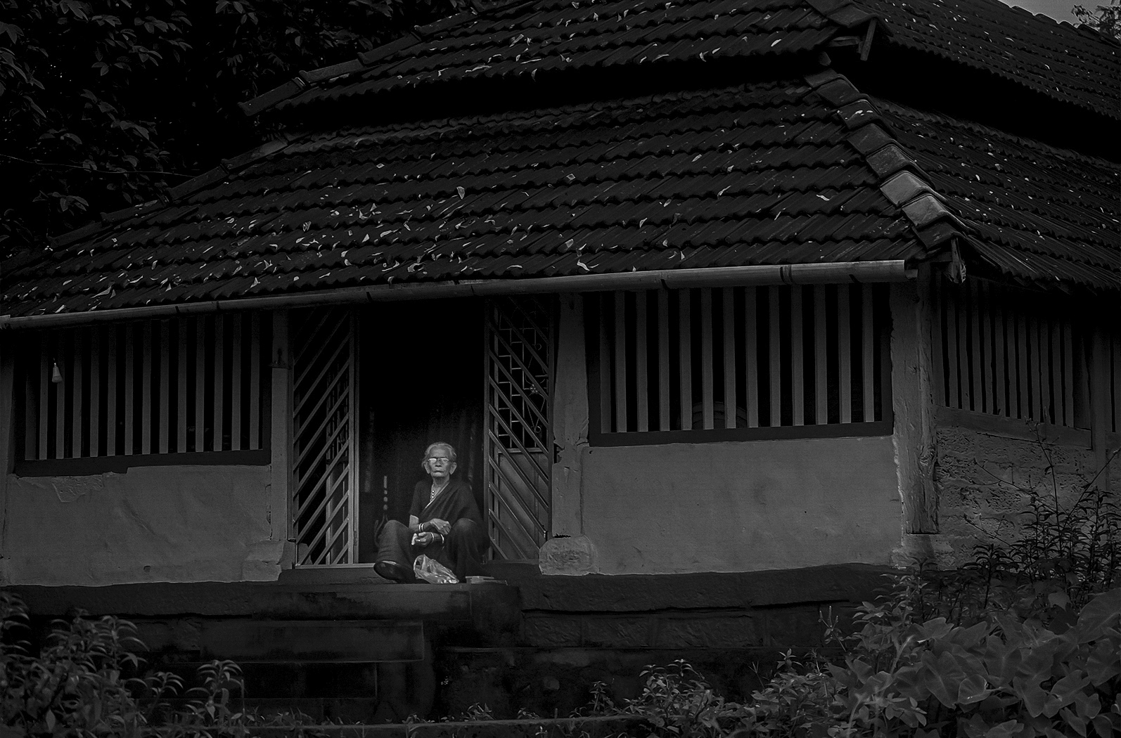
About the Image(s)
This image was clicked at village area. Tried to show lonely life..empty nest.
Image clicked using Nikon D7500, Nikor 18-140mm
F 4.5, SS 1/125s, ISO 1100
6 comments posted
Good concept & execution too. Mood is maintained to the concept. An image is sharp.
Only I felt instead of lady looking at you/ camera, if she would have seen far at the infinite somewhere, it would have created better mood. Looking at the camera kills the candidness of the photo, I feel
But overall image is good Posted: 12/12/2025 02:01:43
Only I felt instead of lady looking at you/ camera, if she would have seen far at the infinite somewhere, it would have created better mood. Looking at the camera kills the candidness of the photo, I feel
But overall image is good Posted: 12/12/2025 02:01:43
& even the reflection in the specs should have been avoided Posted: 12/12/2025 02:02:49
The small single figure in the doorway does create the feeling you describe. I agree with Vinaya that there would be more impact if you were able to capture a moment in which she was looking in a different direction so there was not that glare in the glasses that pulls my eye in a distracting way. Posted: 12/12/2025 09:37:25
Vivek, I like this image for the story that tells us, of an older woman, sitting in front of the door of a typical house in that part of the world. I thing that there is too much empty space. A tighter crop will still tell us the same story and will make the woman stand out better.
Just as a side note, it seems that you added some light to the woman and made the background darker. These type of adjustments are not allowed in Photojournalism. the image has to look as you saw it. Posted: 12/13/2025 10:03:10
Just as a side note, it seems that you added some light to the woman and made the background darker. These type of adjustments are not allowed in Photojournalism. the image has to look as you saw it. Posted: 12/13/2025 10:03:10
(Groups 2 & 4)
Agree that the glare on the glasses is a distraction. To me the whole would be better lightened up a little. It seems so grey overall. I like the B&W treatment though. Posted: 12/22/2025 22:32:27
The black and white treatment feels calm and restrained, but I would personally welcome a wider range of grey tones. Some detail is lost in the darker areas, particularly around the doorway and the structure of the house, and gently lifting the shadows could improve overall clarity. I agree with Isaac that a tighter crop would benefit the image by reducing empty space and directing attention more clearly toward the figure. The scene itself is readable, and subtle tonal and compositional adjustments could further refine the photograph. Posted: 12/23/2025 10:51:20