Dr Isaac Vaisman, APSA, PPSA
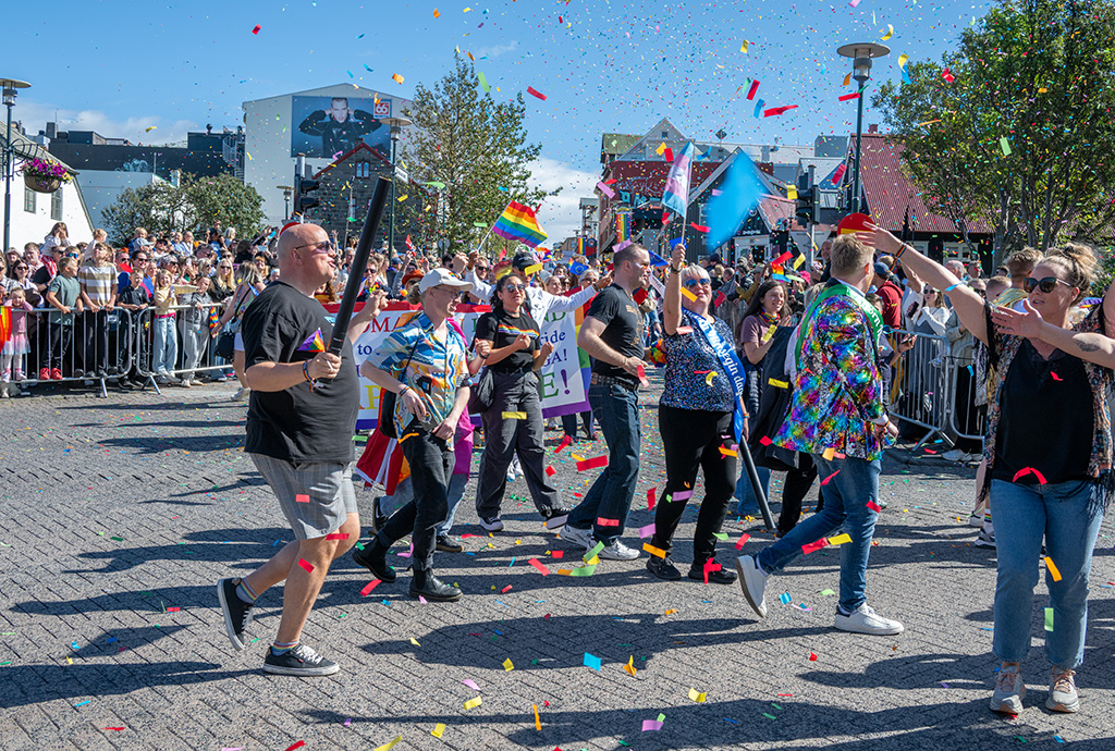
October 2026 - Reykjavik Pride Parade
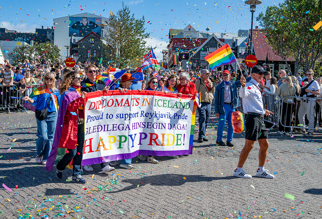
Original
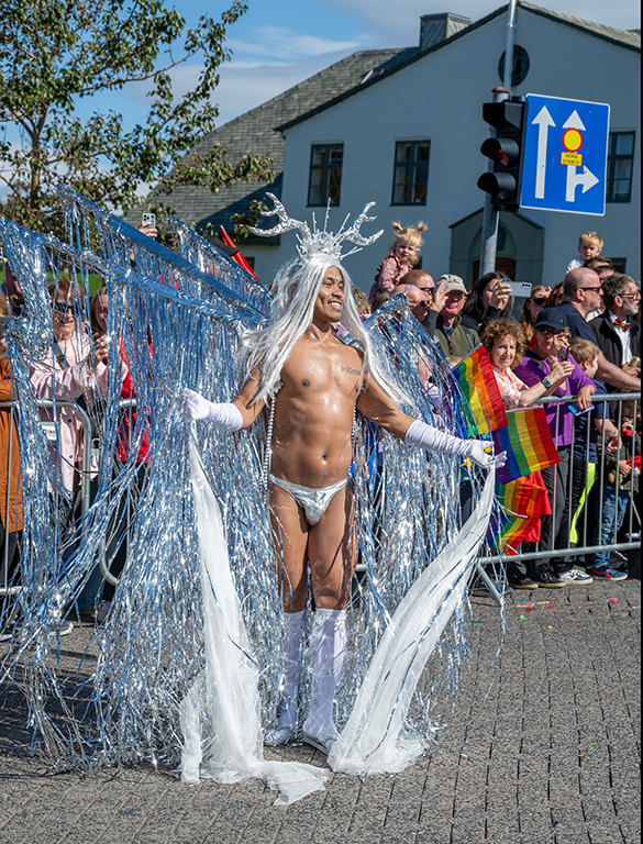
Original 2
About the Image(s)
Last year in August was the Pride Parade in Reykjavik �“ Iceland, often referred to as “the world’s biggest small Pride” drawing locals and tourists alike to honor and support the LGBTQIA+ community. It is a colorful festival that transforms the city. Each year tens of thousands of participants join to celebrate, creating an atmosphere of acceptance and love.
The image was created with the Nikon Z8 with the Nikkor zoom lens Z 24-200 mm f/4-6.3 @ 35 mm and these settings: ISO 360, f/8 and 1/500 sec. The image was PP in LightRoom and cropped.
I am adding a couple more images to illustrate another group supporting the Pride Parade, and one of the highlights.
11 comments posted
I have a penchant for bolder colors. Here, this image was created on a sunny day, and the technicals suggest there was good sun. The description was that this is a colorful festival, and I agree, but the color could have been enhanced even further if the image was compensated at -.3EV. the slight underexposing of the image tends to enhance the colors and would have improved this image. Every image can be justified to be HI, but I separate HI from general PJD because for me, HI images have to evoke some strong emotions, and here it doesn't seem to do that. True, the festival is a joyous time, but it would have to evoke great joy, and I don't seem to get that feeling. Posted: 10/01/2026 05:32:17
Alan, just look at the faces of the participants..... Posted: 10/01/2026 07:47:58
I did. I didn't think they collectively expressed any great emotional feeling.
Clearly they were happy but I think HI needs something more. Besides, the display of image is also in the eye of the beholder. Posted: 10/01/2026 14:13:03
Clearly they were happy but I think HI needs something more. Besides, the display of image is also in the eye of the beholder. Posted: 10/01/2026 14:13:03
Isaac, it looks like it was a fun day at the fair, the larger image had more information in the middle to to the right than the left hand side, it seems to me that the fun was ahead, maybe cropping the a little on the left, I ma not sure about the lady in the from on the right, maybe including her, I know it is so hard when people are moving so fast... I really like the smaller picture on the right, the people are closer and centered plus the single guy adds to the picture! not sure if it is a bit crocked it, as the red circle with the yellow line a, and the lift are tilted to the right... in general I think it definitely shows people were having a good time and the action was of them! Posted: 10/05/2026 14:55:39
Grisel, I like the shadows....if you click on any of the images, they will come up full size so you can appreciate better. Posted: 10/05/2026 20:18:36
I think trying to decide whether or not an image evokes a "strong emotion" in every person who views it is problematic! Some emotions are more subtle than others. In this case, I don't think the expressions of celebration are subtle. I would add that the difference between the Human Interest and the General categories is that Human Interest cannot feature sports competition and must include actual people in the image; in General category, it only requires evidence of human action. This still seems to be causing some confusion, as I noted at the PSA Photo Festival in Las Vegas in September in the photo gallery, there were several photos depicting sports competition on the Photojournalism Interclub Human Interest display board. Posted: 10/05/2026 17:52:48
Lovely, colourful and sharp image with strong emotional impact. On this point, I totally disagree with Alan. The shadows have added good depth to the image. Cropping from the LHS would have removed the spectators, which would have weakened the story.
Yes, if the lady on the RHS had been fully included, it would have been better. But in Street Photography, getting everything perfect is not always possible.
I liked the main photo more. Original 1 has a typical composition, whereas I again preferred Original 2. A very good SP photograph. Posted: 10/06/2026 09:56:00
Yes, if the lady on the RHS had been fully included, it would have been better. But in Street Photography, getting everything perfect is not always possible.
I liked the main photo more. Original 1 has a typical composition, whereas I again preferred Original 2. A very good SP photograph. Posted: 10/06/2026 09:56:00
(Group 4)
Hi Isaac, what a fun image and there is no doubt of the theme behind the scene. The emotion is about fun, joy, and freedom. A place where people let their hair down and do silly things. I like that you have picked a spot where the crowd is turning as this adds some interest - some are facing in different ways, and the contrast in the way people are pointing makes it intersting. What is missing for me is that there is no one clear subject, which might suggest that the image would be more suitable for a general PJ rather than HI. (just my opinion). I agree that a small crop from the left would reduce that dead space. Your setting choices look great and the added effect of all that confetti really adds to the fun. Posted: 10/14/2026 04:18:12
(Group 4)
OH, and just a comment on the two additional images. The first with the pride banner is nice and colorful and sharp so there is no doubt what is going on. However, this is a common presentation of protests, parades and marches so for me it lacks a bit of originality. The second is just WOW and would be an absolute winner in a HI competition (and general PJ too). It has everything, it's brazen, its fun, its sharp and just a bit different from the usual pride portraits. Posted: 10/14/2026 04:20:37
Thanks Jen Posted: 10/14/2026 10:56:28
Hi Isaac,
for me, the strength of this image is mainly in the overall atmosphere and the feeling of movement. The confetti, the gestures and the different directions in which people are looking give the scene a lot of energy.
I agree with the comments about the framing. Personally, I would probably try to shift the composition slightly to the right, or crop a little from the left, because most of the stronger activity is happening in the center and on the right side of the frame. I also think the woman on the far right is visually important enough that having a little more space around her would help.
Overall, I think the image captures the lively atmosphere of the parade very well. Posted: 10/16/2026 14:30:17
for me, the strength of this image is mainly in the overall atmosphere and the feeling of movement. The confetti, the gestures and the different directions in which people are looking give the scene a lot of energy.
I agree with the comments about the framing. Personally, I would probably try to shift the composition slightly to the right, or crop a little from the left, because most of the stronger activity is happening in the center and on the right side of the frame. I also think the woman on the far right is visually important enough that having a little more space around her would help.
Overall, I think the image captures the lively atmosphere of the parade very well. Posted: 10/16/2026 14:30:17