Richard Distlerath
March 2025 - For the Love of Water
Original
About the Image(s)
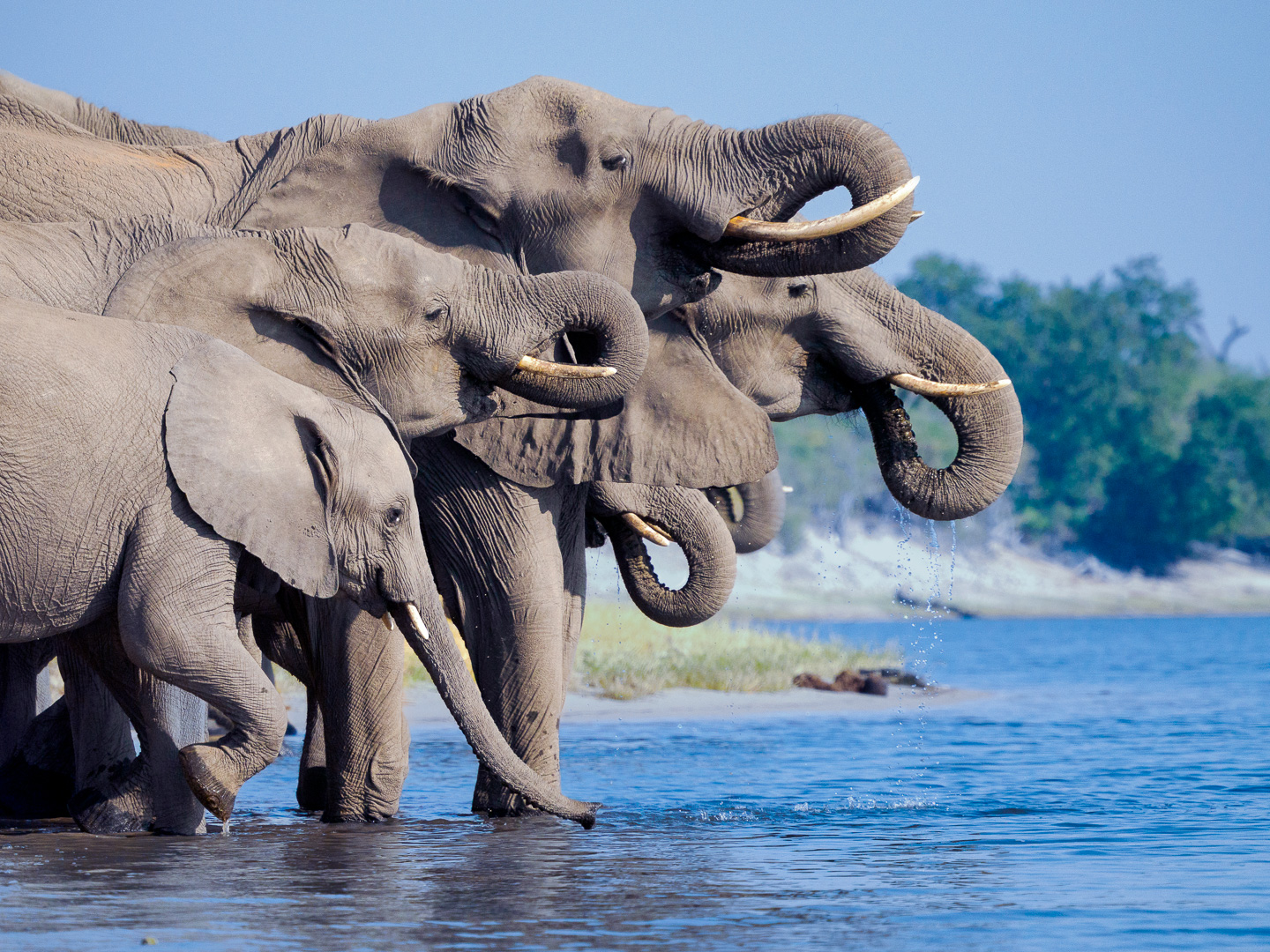
I had overlooked this photo on my first round of selections. It was taken in the harsh light of day along the Chobe River in Botswana. Image was taken with OM1 Mark2 with 150-400 mm at a focal length of 188mm (376 full frame) - 1/4000sec, f5.6, and iso 1600. I had been shooting birds and did not chage my camera settings. Ok but not optimized...I wish I had halved the speed and doubled the aperture.
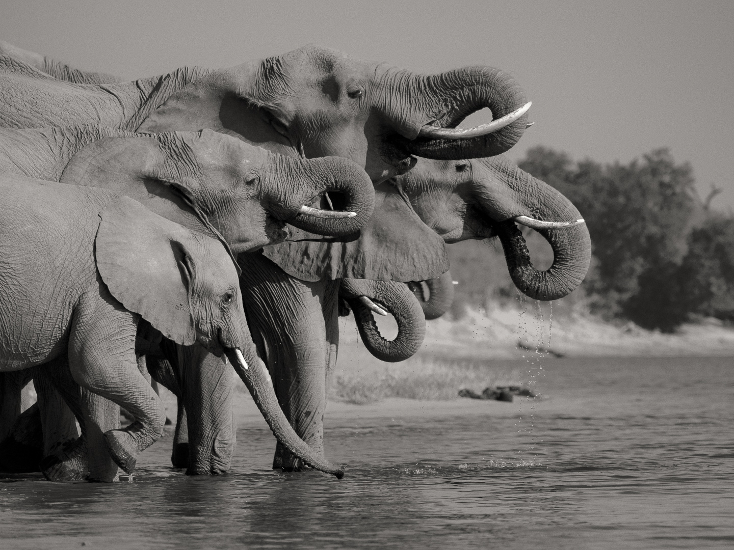
The color image is the safety shot as it represents what was seen. The B&W is same image converted to soft sepia.
What reasons do you prefer one over another?
This round’s discussion is now closed!
6 comments posted
(Group 7)
This is a GREAT photo. Love it. Great focus and incredible action. Posted: 03/11/2025 09:26:04
Thank you!
Posted: 03/11/2025 09:48:38
Posted: 03/11/2025 09:48:38
Richard, the composition is very pleasing. Great shot. I prefer the black and white - it helps with making the light less harsh seems to me. Posted: 03/14/2025 14:16:51
Very nice image. I love the lineup of the trunks and the fact you can see *almost* all the elephants' eyes. Also they all have tusks - there is a rise in tusklessness in the elephants in that area due to poaching of the big tuskers. (It's a recessive gene that is lethal in males.) I agree with your cropping, and sympathize with the exposure issue. There is so much to photograph on safari that such things are common.
Personally, I would enter the color version in ND, the mono version in Mono, and might try the mono in PT as well. Mono images rarely do well in ND, but I don't have enough experience judging PT to really know how they do there. I think PT tends to be judged more pictorially, which means that bright BG will distract a bit in the color version.
Lillian Posted: 03/17/2025 20:07:12
Thank you! I will look into the Nature Division. Yes I can see how some of my images fit btter there than in the PT. Posted: 03/18/2025 09:43:16
Excellent composition, Richard! The black-and-white treatment works wonderfully here, toning down the harshness of the light. Posted: 03/27/2025 18:29:13