Deborah Albert
June 2026 - Small but mighty
About the Image(s)
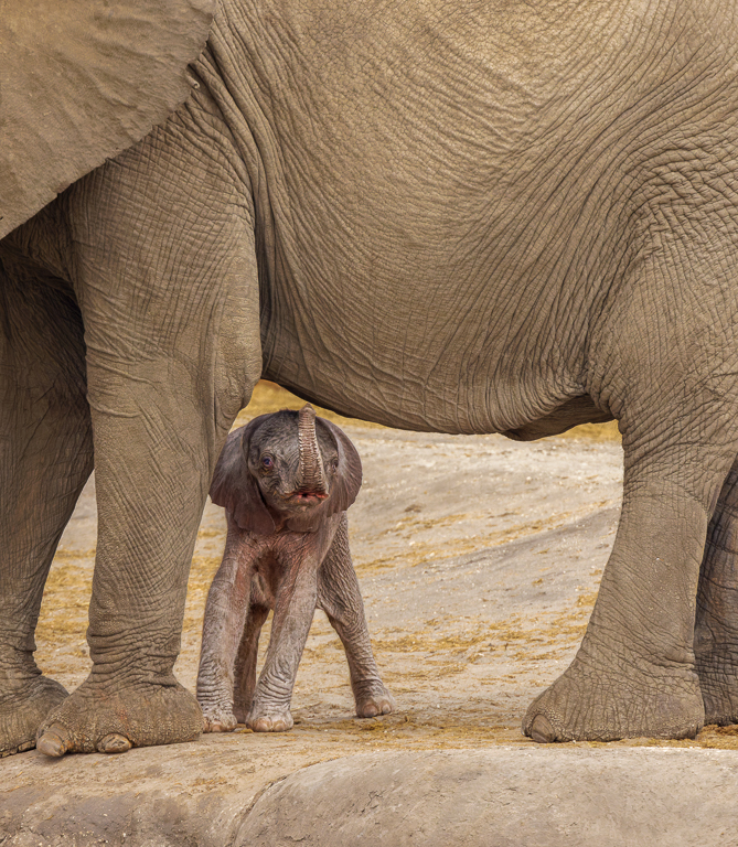
Small but mighty f 7.1 1/1250 iso 1250
7 comments posted
Really adorable image! I like the composition, though I think it would work even better as a horizontal, cropping out most of the body of the mom.
I also like it flipped. The eye tends to enter an image from the lower left corner and follow any leading line into the image, so having the main subject at the right-side on a "power line," helps keep a person looking. Add a sturdy ele leg on the far right, and the viewer tends to "bounce off" and stay within the image longer.
See what you think.
Posted: 06/13/2026 17:42:00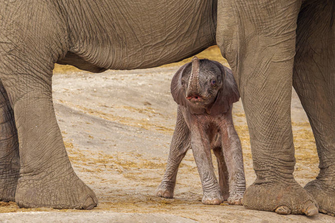
Deborah Albert
Thank you for your input. I do think showing more of the mother emphasizes how small it is. Posted: 06/15/2026 15:55:38
Richard Fisher
I agree with Lillian. The horizontal is much stronger, though I would try with the calf on both the right and left. Tough call which works better.
Did your guide estimate the age of the calf? Posted: 06/14/2026 11:36:12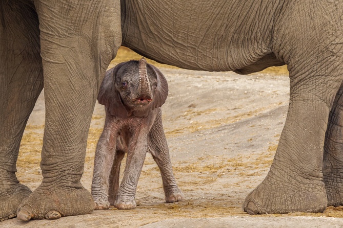
Did your guide estimate the age of the calf? Posted: 06/14/2026 11:36:12
Deborah Albert
Under a week. Posted: 06/15/2026 15:53:44
really nice image. It does look better flipped, as others have remarked. Just curious, where did you take it? Posted: 06/15/2026 12:47:25
Deborah Albert
Zimbabawe Posted: 06/15/2026 15:54:27
Excellent image . Very cute. Excellent sharpness on the calf's face and trunk. The texture of the skin of both adult and baby has been beautifully rendered. Exposure is well controlled despite the mixed lighting on the adult's legs.
I think that the image is clean, simple, and nonâ‘distracting. The sandy ground adds context without competing for attention.
Posted: 06/15/2026 13:22:25
I think that the image is clean, simple, and nonâ‘distracting. The sandy ground adds context without competing for attention.
Posted: 06/15/2026 13:22:25